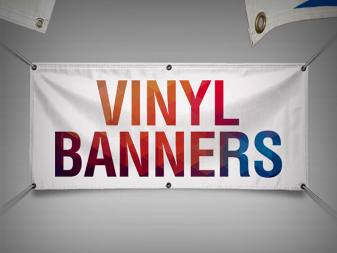
When it comes to designing a vinyl banner for your organization, businesses often make the mistake of opting for the cheapest option!
According to leading advertising professionals, this is a bad starting point, which compromises the ROIs that you might be able to generate from the same.
For example, going with the best thing which can help your business-
- Attract the attention of target audiences and invite them to check out your shop or showroom.
- Boost customer queries, walk-ins, and data generation that you would want to make for your business.
- Provide credible information on sales, discounts, or other offers to the customers for your business.
- Convey the completion of new milestones to existing and prospective customers around your business.
- Drive sales, revenues, and profits while building a solid brand that is visible to your target audiences.
As you can see from the list above, with the right vinyl printing and banner ads, you will be able to generate the best type of traction for your business.
In this article, we are going to list down the top tips which can help you make your thing stand out.
List of 5 Top Tips to Make Your Vinyl Banner Eye-Catching and Attractive:
1. Get on board a great and reputed vendor
If you want to guarantee the success of your vinyl banner, make sure that you sign on board a great printing company. Reputed and credible vinyl banner printing companies have great knowledge, use quality products, colors and even have their own team of designers that can help you optimize the design, styles, and patterns. For more in this regard, visit color x.
2. Let the banner convey your brand story and messaging
If you want to create a vinyl banner that stands out, you need to focus on integrating your brand’s messaging into the post. This means that your brand colors, fonts, and other emotions should find a place in the banner. This will help create a long-term identification with your brand. You also need to make sure that all your promotions echo this line of thought.
3. Colors, fonts, and designs are all important elements
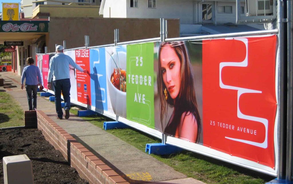
Imagine placing a vinyl banner on a busy street. To make someone read or engage with your banner, you have at best one to two seconds. In that brief period, people should be able to get a gist of what your banner is trying to convey. The role of bold fonts, eye-catching colors, and other overall designs needs to be optimized for best recall value.
4. Include correct information or terms and conditions in the banner
Most businesses use this thing to announce season-end discounts or offers. However, when customers see the same and visit the store, they are told of terms and conditions. Avoid using such clickbait types of strategies. This only tarnishes the image and reputation of the brand. Make sure, to be honest in your communication so that customers are not shocked later on.
5. Keep the messaging and CTAs as simple as possible
Remember we told you that people who see the banner have just a few seconds. The thing is that your messaging needs to get across in that limited timeframe. This is why you need to have only one CTA and messaging in each banner. Not more than that. As a business, the simpler your message is, the easier will it be for the customers to engage and absorb.
Bonus Point- Distance, location, and metrics-
A lot depends on where exactly this thing is going to be placed. Please consider the distance or space that will be between the individuals on the road and the banner (physical distance). Additionally, focus on the lighting aspect. Are you providing some LEDs or will the same use natural sunlight and streetlights for visibility? Please pay attention to these factors.
Mistakes to Avoid When Printing and Installing Your Vinyl Banner
We are confident that if you pay attention to the above tips, you will be able to generate better ROIs on your businesses’ vinyl banner. Advertising experts point out that it is not only about what you should do (tips), but also about what you should avoid (mistakes) that can help you-
- Cheap Quality- The first mistake that should be avoided is going for cheap and substandard vinyl material. Ideally, businesses should invest in curl-free vinyl that is durable and can withstand the forces of nature. You also get better colors and less bleeding on them.
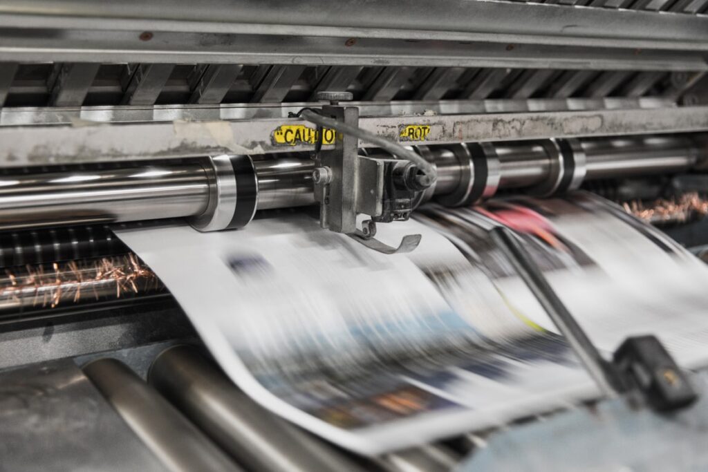
- Substandard Printing- Almost all cheap vinyl printers use screen-grade printing. The thing is that this goes limp and curls up pretty soon. You need to choose printing companies that work with digital inkjet printers. This is professional-grade work that you require.
- Delicate Fonts- Outdoor print media cannot use the same fonts that look pretty attractive on a 14-inch laptop screen. You need to ensure that your fonts are bold and striking so that they will hold up well during the printing process, as well as make reading easier.
- Large Dot Gain- Cheap vinyl banners that are printed using a screen-grade printer have a very high dot gain margin. This is not something that you would want for your business. the smaller the dot gain, the better will be the colors, fonts, and legibility of the banner.
- Cheap Costs- When it comes to this, price is directly proportional to the type of quality you are getting. In other words, advertising experts suggest that you should not be making this a priority. Rather you should be focusing on the quality of the output.
Final Takeaway
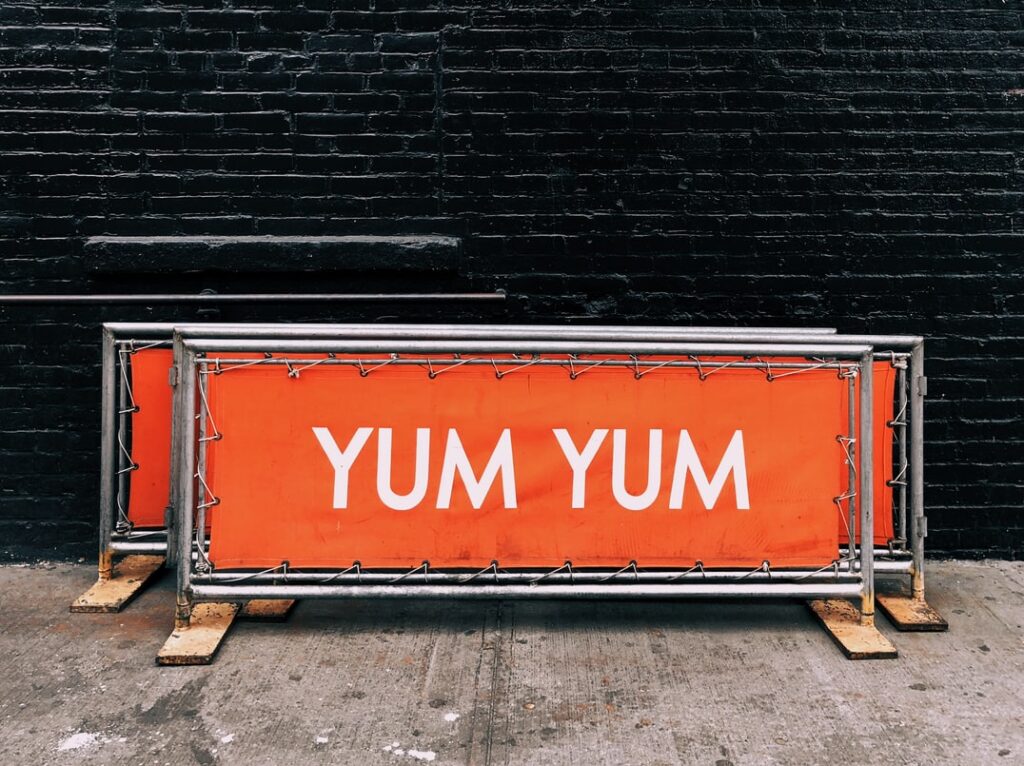
Think of yourself and why you tend to visit some establishments or businesses post seeing their vinyl banners that are strategically located. Think about what the banner had forced you to go home and discuss the same with your partner, friends, or family members.
There is a lot of planning that needs to go into vinyl banner printing. By following all the points mentioned in the article, you will be able to create the best vinyl banner for your business. If you have any more questions or clarifications, please let us know in the comments below.

