So you got those new wooden shelves, and they’re gorgeous. Problem is, now you have no idea how to style them. You’ve got a lot of pretty things that you want to display, but when you look at the shelves, it’s just too overwhelming. What do you put where? How do you know what will fit? When do you stop? Why does it just look… wrong. Maybe the books are too tall and block the view of your favourite vase, or maybe you just can’t figure out how to make the framed photos look like they belong.
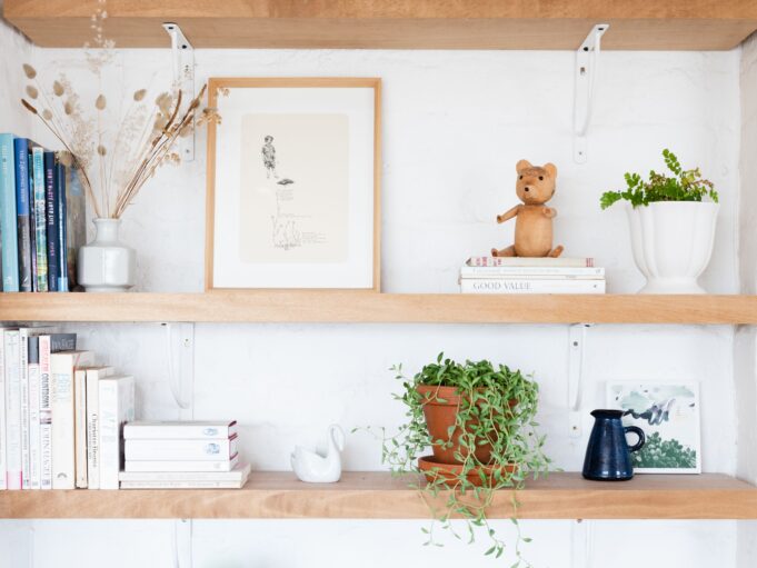
It can be intimidating, but it doesn’t have to be! Here are some tips for styling your floating oak shelves, HandCraftedShelves (or any other kind of shelf) that will make them look like they belong in a magazine without making you want to tear your hair out in the process.
It’s a little like a puzzle: once you know how to approach it and what pieces to look for first, it gets a lot easier. The most important thing is to keep playing with it until it feels right—but in order to know when it feels right, you do need to understand some basic principles of styling shelves.
1. Books Are A Great Place To Start
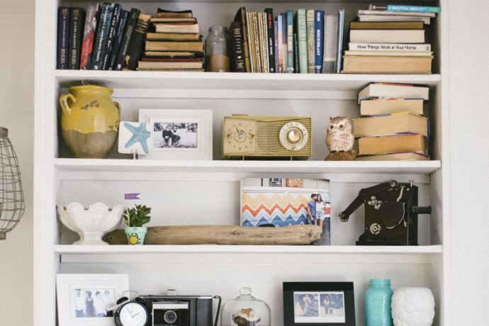
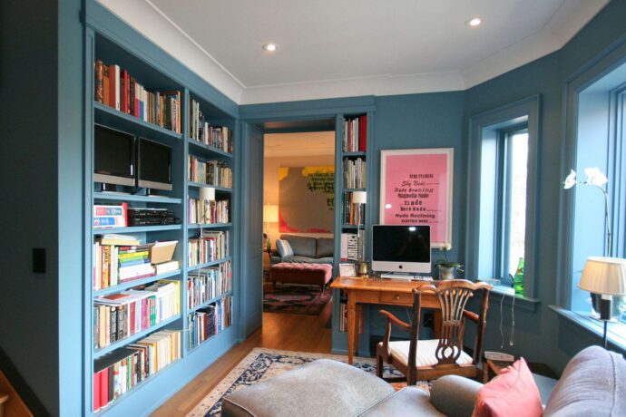
Have you ever thought about just clustering books together? It’s quite a simple idea and can make a big impact. You could colour block them (grouping all the red spines together, for example), you could stack them vertically or horizontally, and you could even stack them in L shapes. I know it sounds like an obvious option, but sometimes that’s the way to go!
What about adding an old ornament on top of the pile of books- it gives it a nice contrast and makes it feel resolved. You can also use books on their side as bookends or as foundations for other items. They’re really useful and almost always look great no matter where you put them in your home.
2. Fill Negative Spaces

Too much empty space can make your shelves look incredibly bare. The pieces on them can appear staged, like an art gallery, with three or four individual items running along the shelf with a lot of space in-between. A shelf is at its best, stylistically, when it looks less thought out. So veer toward filling more of the negative space.
The key is to make sure that each item has something of interest about it: colour, shape, pattern, etc. And then, instead of just placing one colourful thing on the shelf, think about how you can group two or three together to create a cluster that’s more visually appealing than just one piece.
3. Impose Imaginary Boundaries
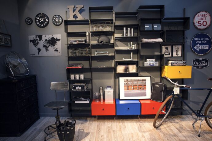
If you find it easier to style cubes shelves, there’s a good reason why: a cube has obvious boundaries you can’t go over. A shelf, on the other hand, is basically just one long plane. So how do you create distinct scenes on a wooden shelf?
The easiest way is to set up separate areas or scenes along the shelf, but ensure each one touches the next. You just have to ensure that each scene feels separate while also feeling part of the bigger picture.
This approach is subtle, but it works, especially if you ensure your boundaries on each shelf are at different points along the plane so that everything is not symmetrical.
4. Variety And Contrast Are Key

Do you know what’s better than having a shelf that feels like it’s full of the same objects? Having a shelf that feels like it’s full of different objects.
So if you can, mix things up: old and new, hard and soft, round and square—even random knick-knacks that people will ask about. It’ll make your space more interesting, and it’ll start conversations.
5. Create A Visual Story
When you’re putting together a shelf, we recommend starting with a central theme or story. For example, you can feature an item that has a lot of sentimental value to you- have the item be the main focus and then fill the shelf around it with other items that make you feel good.
Another option is to find a way to recreate an experience or memory on your shelf. If you have artistic talents, consider painting something that reminds you of a happy time in your life. If not, think about how you can craft something with found materials that bring up positive emotions when you look at it.
6. Don’t Be Afraid to Let Your Objects Go Rogue!

A common bad habit when it comes to organising a shelf is to place everything in a straight line. But remember that this piece of furniture- even if attached to a wall- is a three-dimensional object, and it will be seen from varying angles.
With that in mind, tilt square objects at an angle to mess with the clean lines, lean some pieces at the back of smaller objects, and ensure there are varying heights on each shelf. Overlap some of your photo frames, turn some books around so you don’t see the spine, and consider turning objects on their side.
Whatever type of shelves you’re styling, whether cube, floating, flatpack or handmade shelves, we encourage you to have fun! Your shelves are a chance to show off who you are in a way that can’t be done anywhere else.


